OVERVIEW
Driveline Rental is a car rental service based in Sydney, Australia who provides an affordable yet comfortable car rental options. As the business was new in the market, they required new promotional material to help them separate themselves from their competitors and introduce themselves to new potential clients. As the company has an established brand identity, the deliverables had to incorporate specific colours, icons and the logo.
The deliverables i was tasked with creating were a brochure design, pamphlets, a poster and business cards.
ROLES:
Illustration
Layout
Production
TOOLS:
Adobe Illustrator
Adobe Indesign
Adobe Photoshop
WALL BANNER
The banner created for the business captures the brand's ethos, by adding comprehensible phrases such as "affordable price, excellent experience" and "prices as low as $30 per day", the business presents itself as budget-friendly. With the call to action being placed at the top of the banner, it encourages viewers to identify the purpose as well as what the company is about. Towards the bottom of the banner, each bit of information is placed in its own separate bracket, which is identified by the separation of brand colours. The black box is also angled in a specific direction, mimicking the angle of the road, creating more of a palatable viewing experience for the customer, when they transition from the top of the banner to the bottom, when searching for more details. With more than half of the banner using lighter colours, and depicting the sky, the banner creates an airy feeling, fulfilling the request of the banner having a lighter appearance.


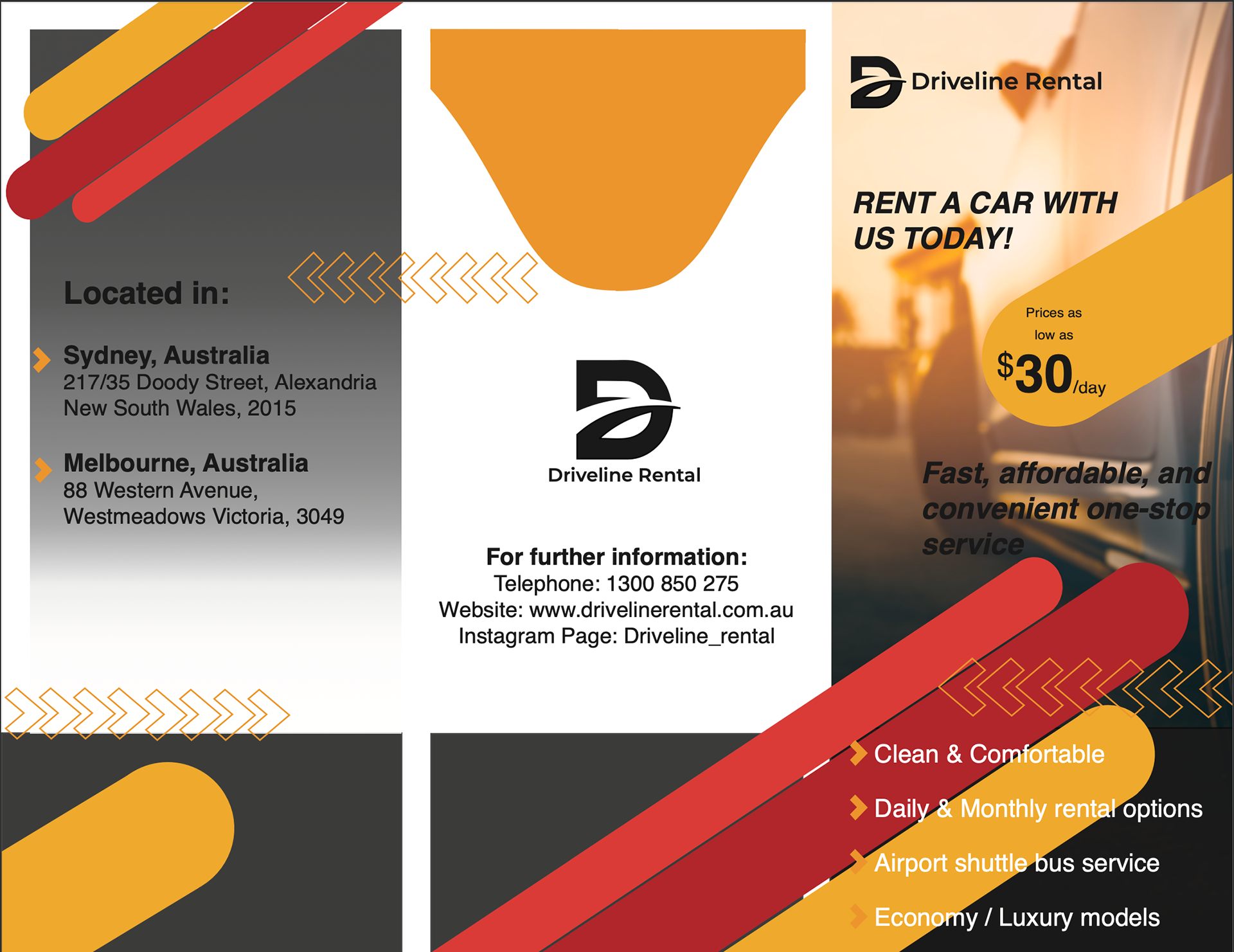
BROCHURE
The brochure was to be placed on the counters of the receptions to have the maximum reach with new customers, therefore in order to stand out, the brochure was made to be bold and impactful. This was achieved by using the brand's colours and icons arranged within an eye-catching manner. The trifold brochure structure was considered while creating the design as some designs crossed over two pages, beckoning the clients to follow the design to the page. This is seen within the first page, subtly luring customers to look at the business details. This is also seen within the second page, as encouragement to continue reading the content through the natural progression, left to right, before falling onto the last page, making customers more lightly to book as they had just finished reading the companies policies and ethos.
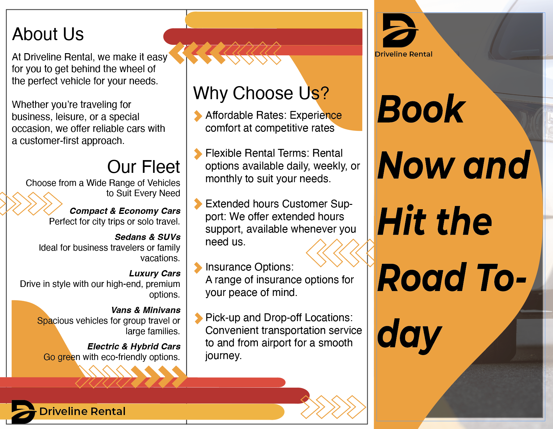
PAMPhLET
As the business wanted to cover as many marketing avenues as possible, a pamphlet was also created in parallel to the brochure, to hand out to customers and provides a shorter and easier option for customers to skim through, retaining their interest.
The pamphlet also has bold impactful qualities such as a call to action on the front as well as similar colours and symbolism as the brochure. However, unlike the brochure, the pamphlet articulates directly what the core messages of business is, only stating the reasons why a customer should choose them over a competitor and the business's information.

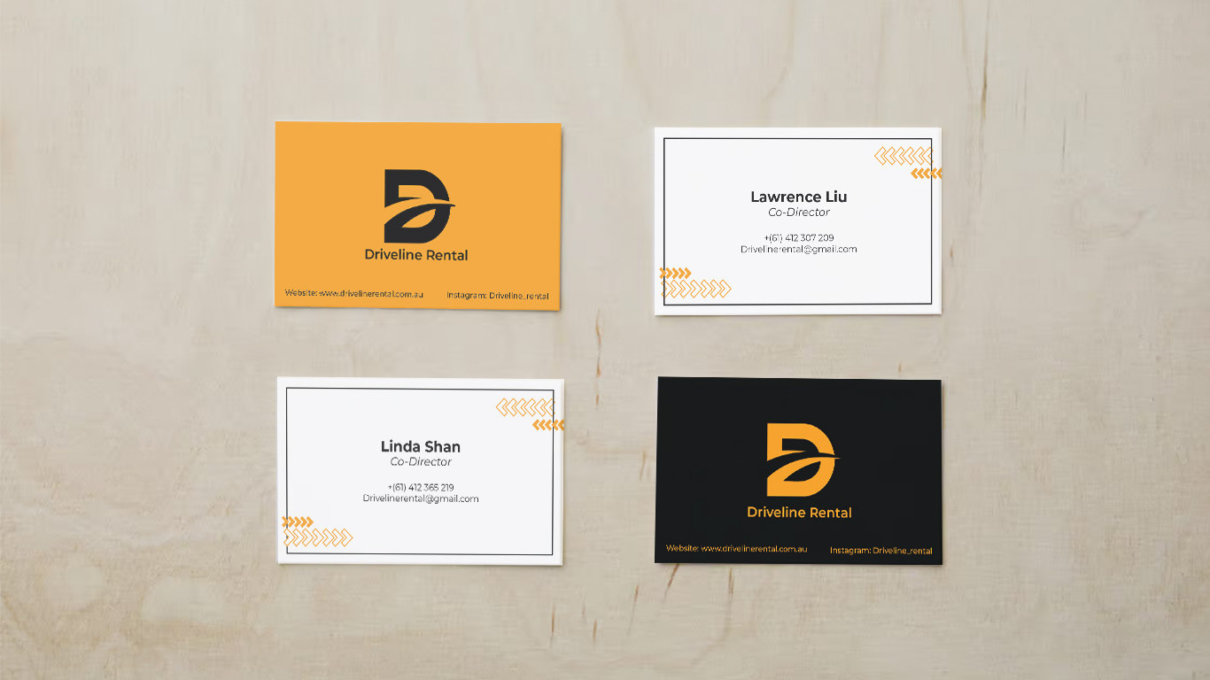
Business Cards
The theme of the business cards were requested to be bold and modern with a simple layout.
I had made two different colour-ways for the business cards, with the primarily yellow card showcasing more of a bold look, and the primarily black card having more of a modern appeal.